English
Navigation Icon System
Zakres:
Organizing navigation across an extensive ecosystem of brand products and services — from consumer offers to the corporate segment.
Solution:
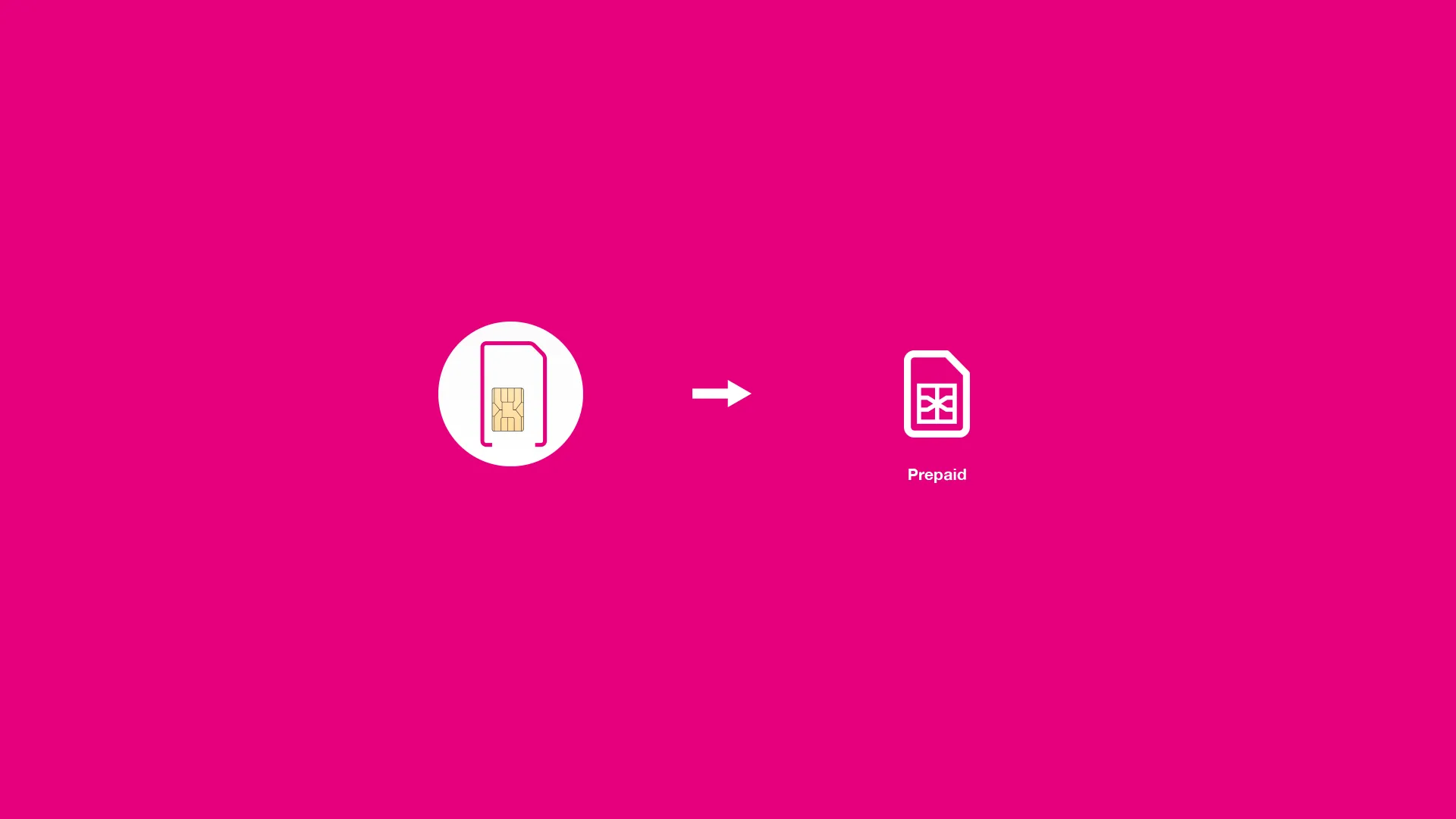
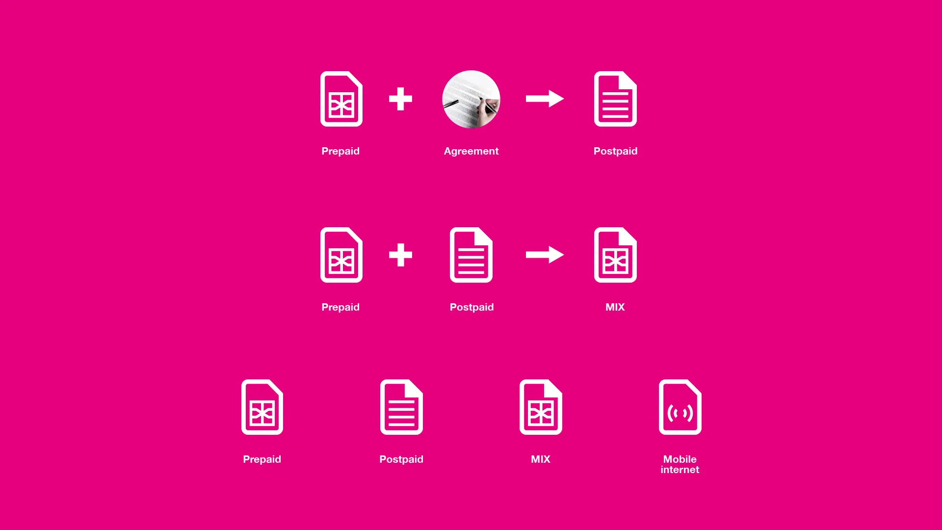
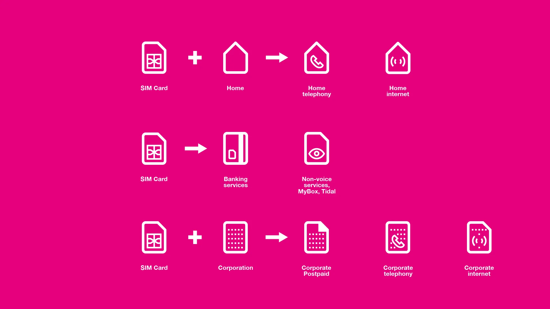
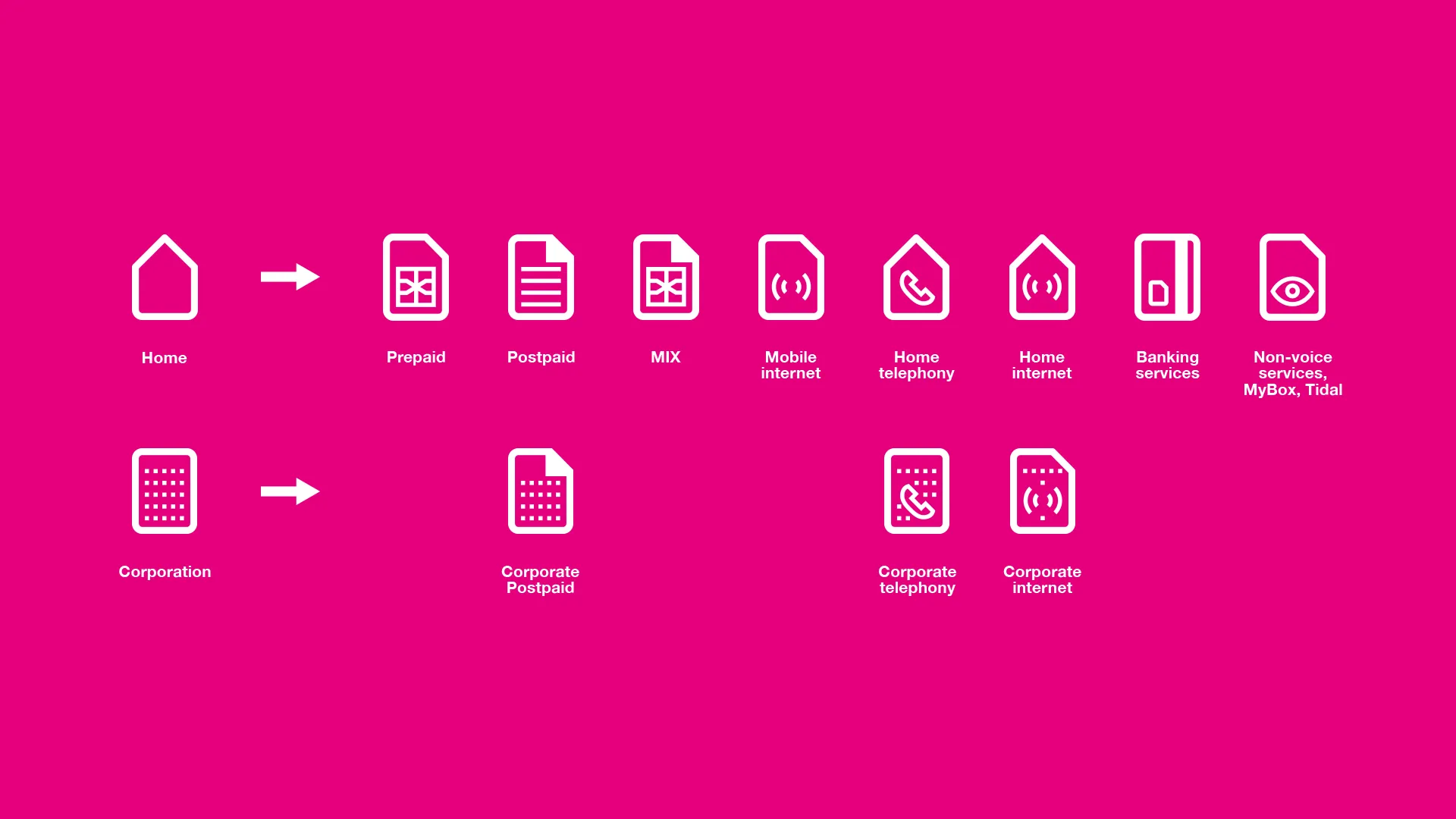
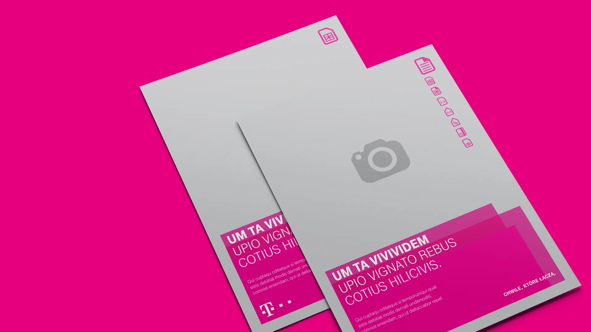
Rather than designing each icon independently, the system was built on a single base module — the SIM card shape — which describes all product categories through interchangeable internal symbols. This makes the system immediately recognizable as coherent and easily scalable to new services. Result: The system covered a dozen product categories and communication channels — from prepaid and postpaid to home and corporate services.
Scope
Brand Identity, Art & Creative Direction
Client
T-Mobile