English
2015 Social Report
Task:
Annual social report for Poland's largest commercial bank — a complex document combining financial data, strategic narrative and CSR communication.
Solution:
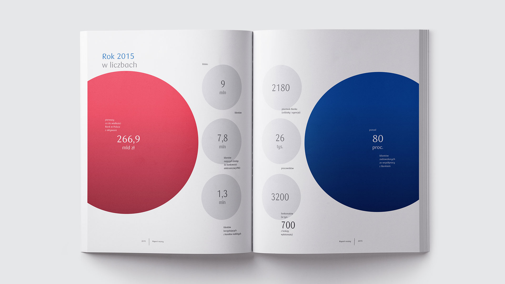
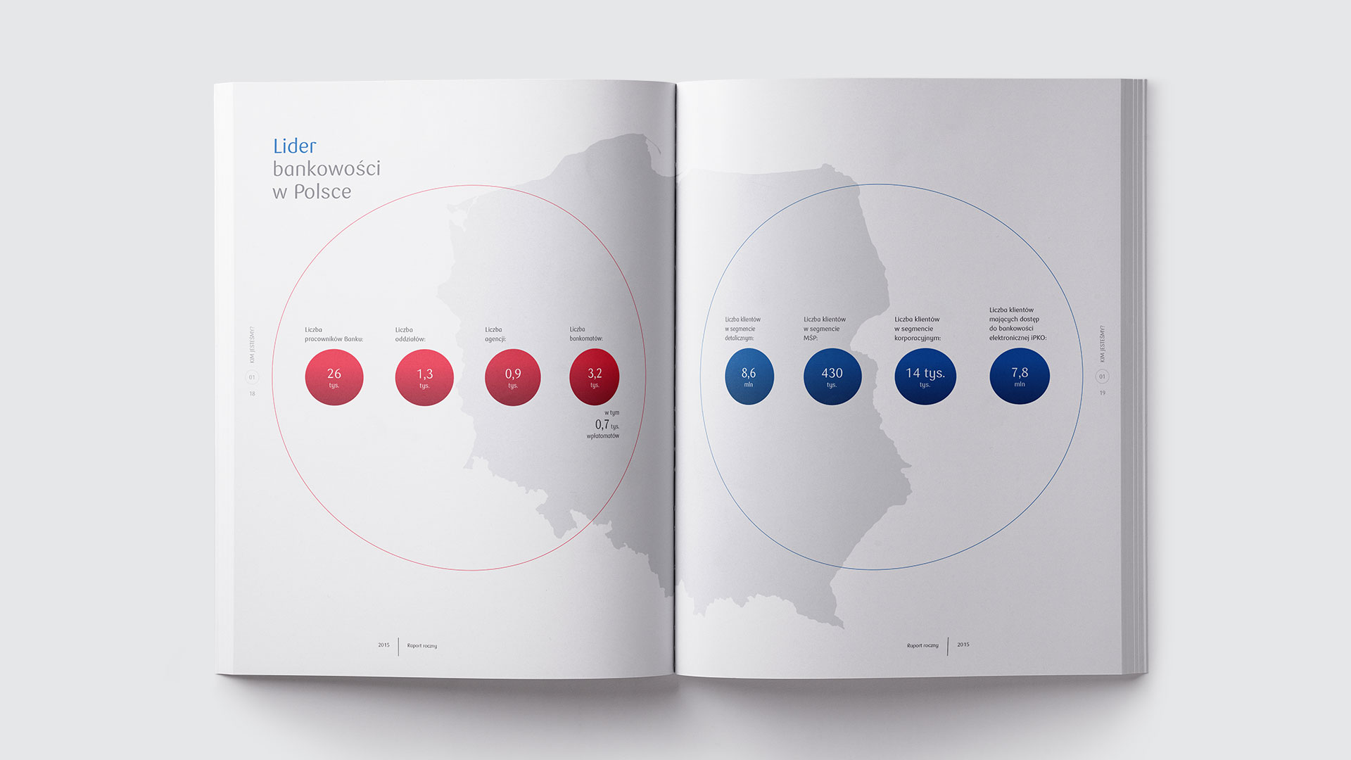
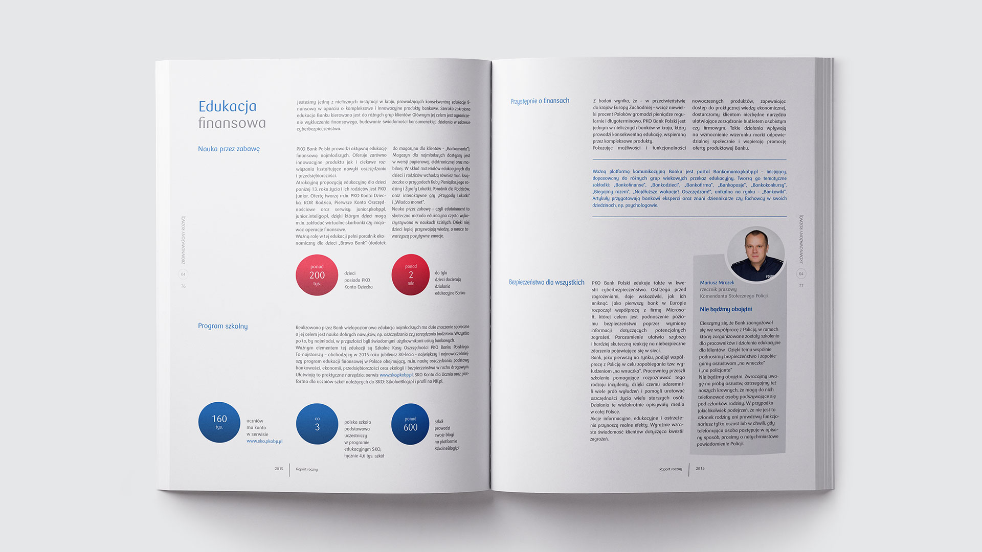
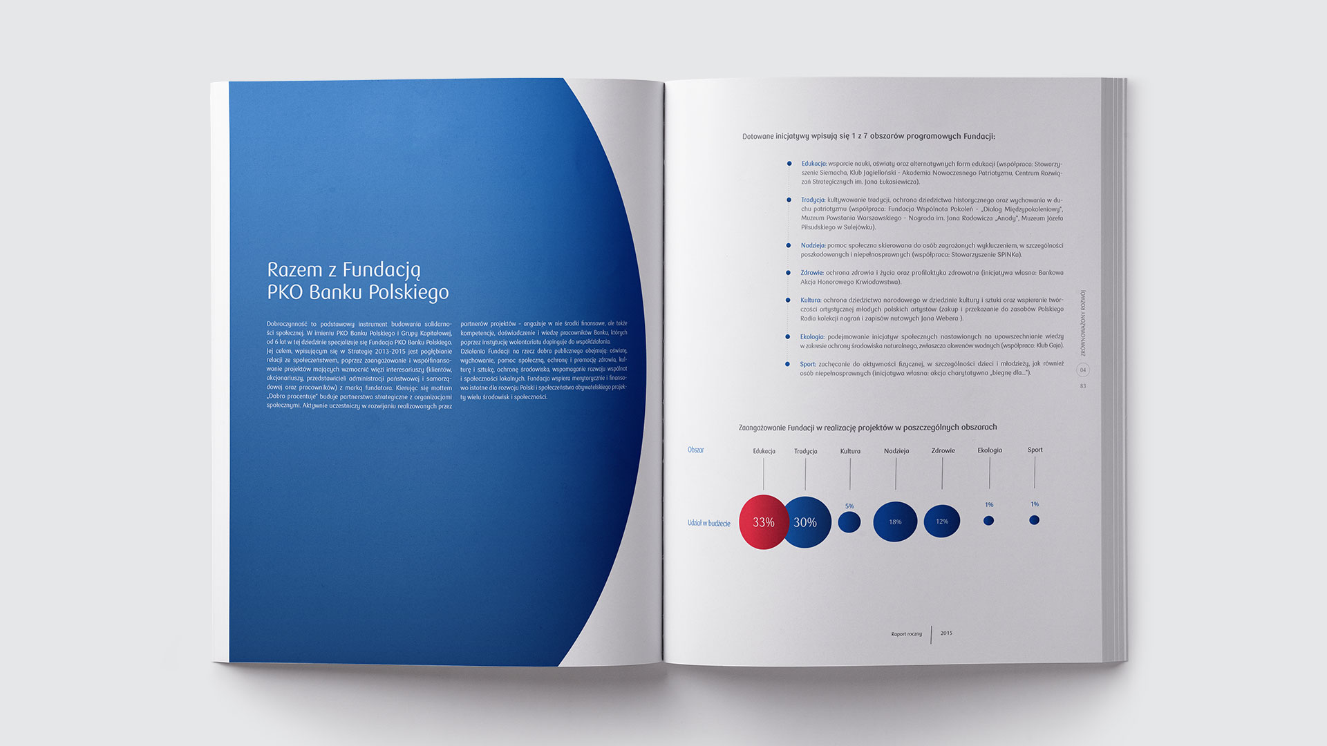
Rather than reaching for standard chart formats, financial data was translated into the language of circle geometry — a form present in the bank's identity for decades. Circles scale proportionally to values, replacing bars and tables with something readable at a glance. A restrained palette and generous white space maintain legibility across dozens of pages. The system holds together consistently from cover through infographics to text spreads.
Scope
Editorial Design, Art & Creative Direction
Client
PKO Bank Polski