English
Packaging System Redesign
Task:
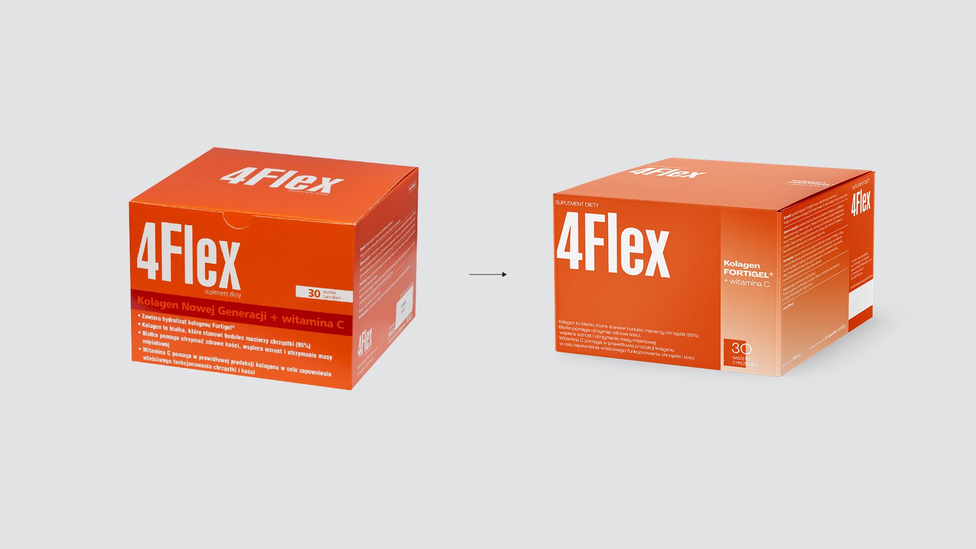
Visual identity refresh for 4Flex dietary supplements while maintaining brand recognition.
Solution:
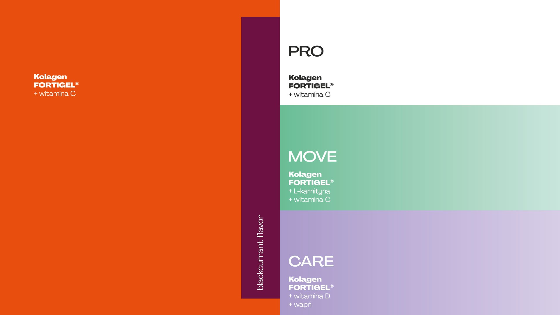
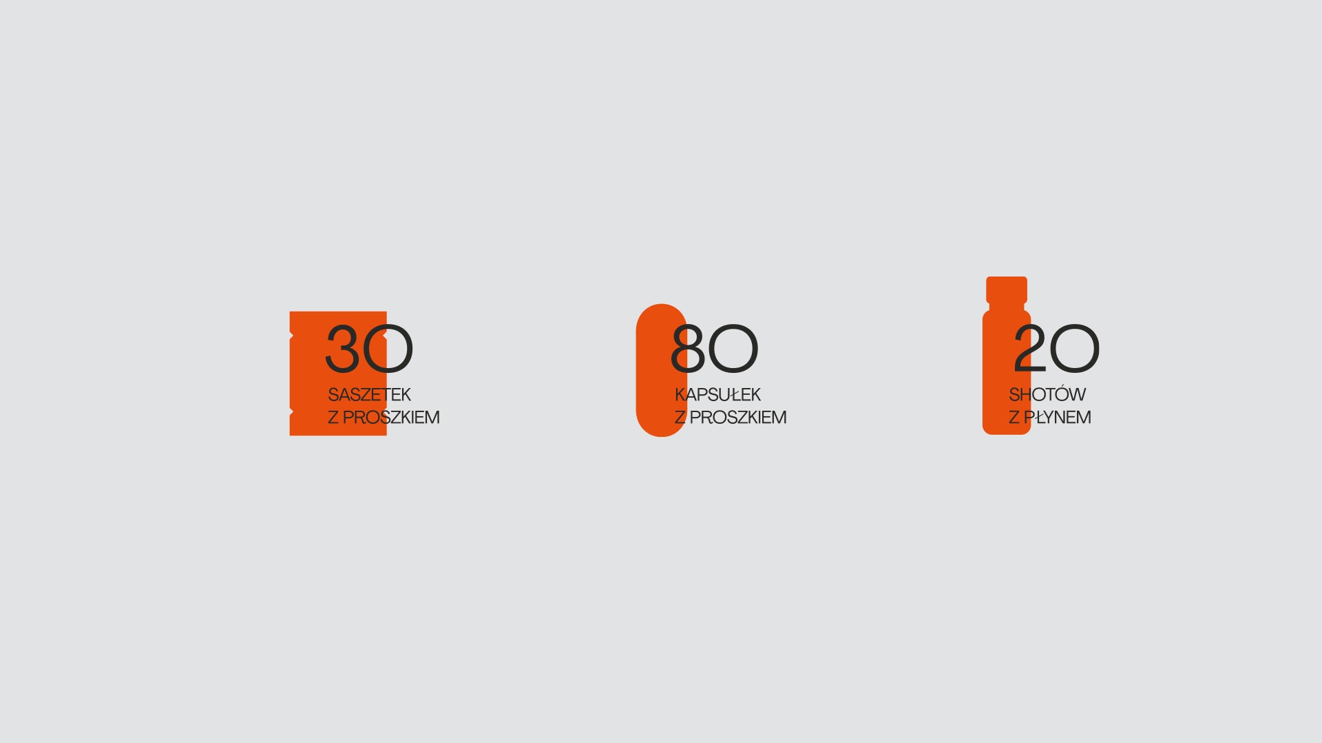
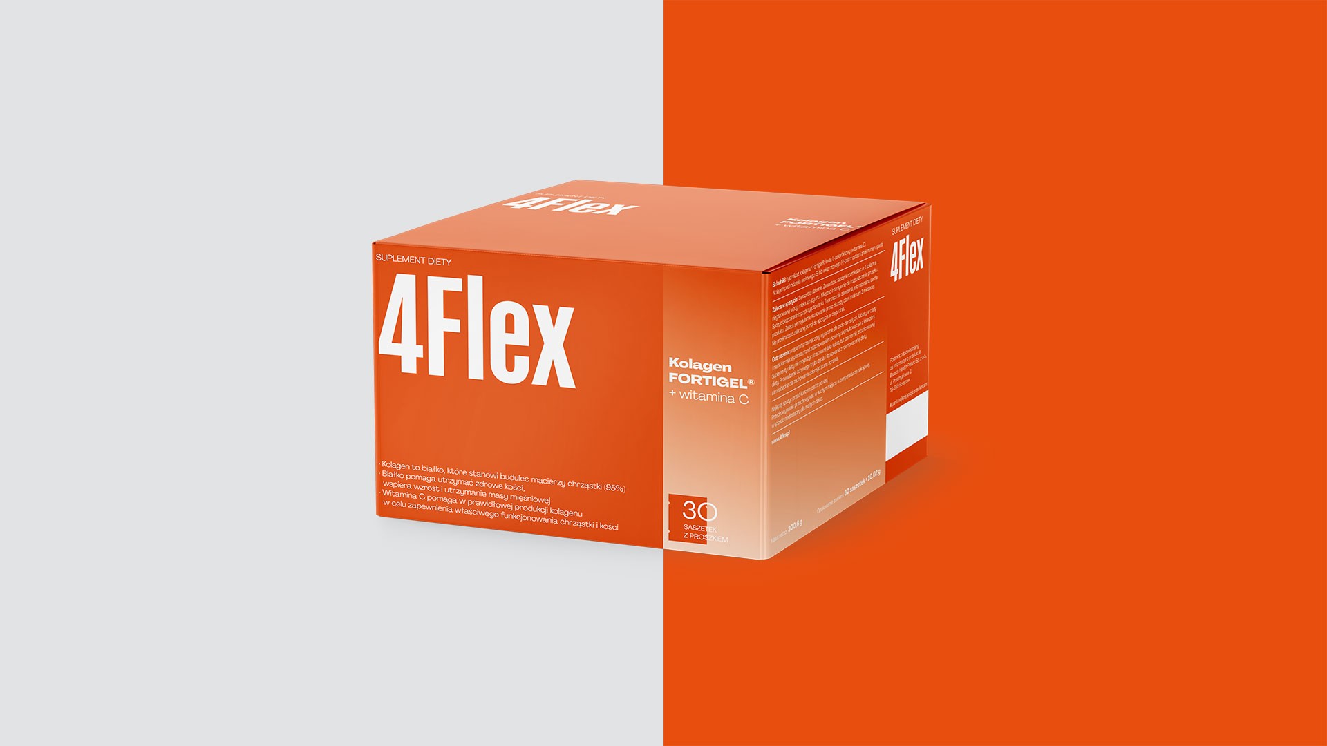
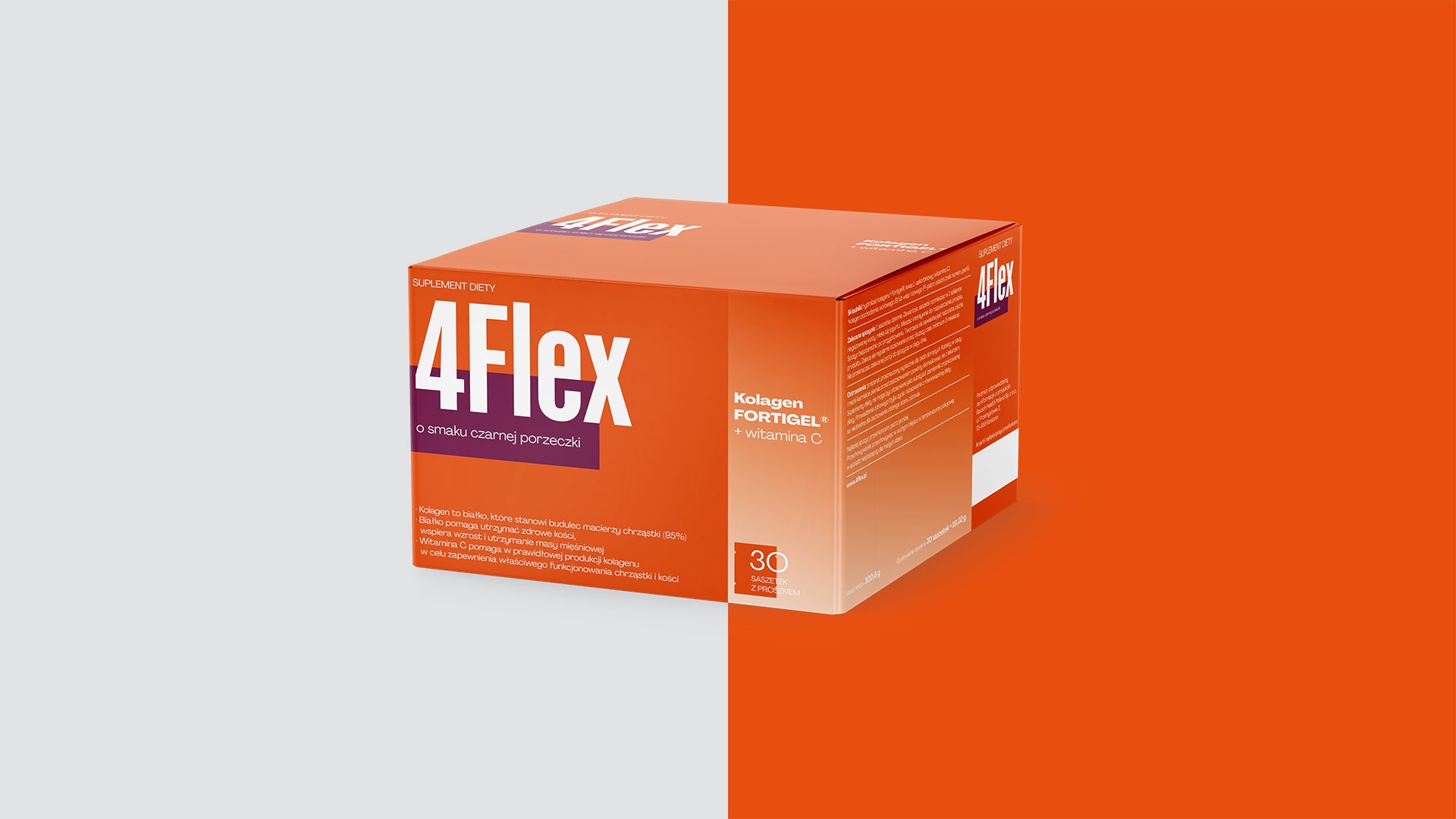
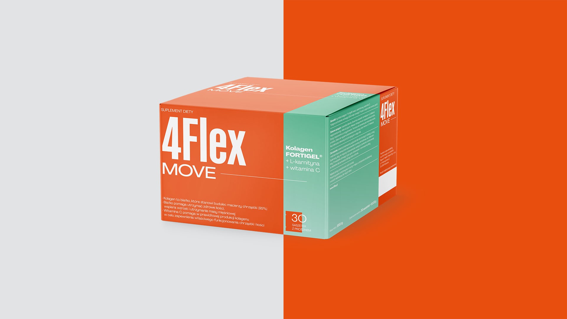
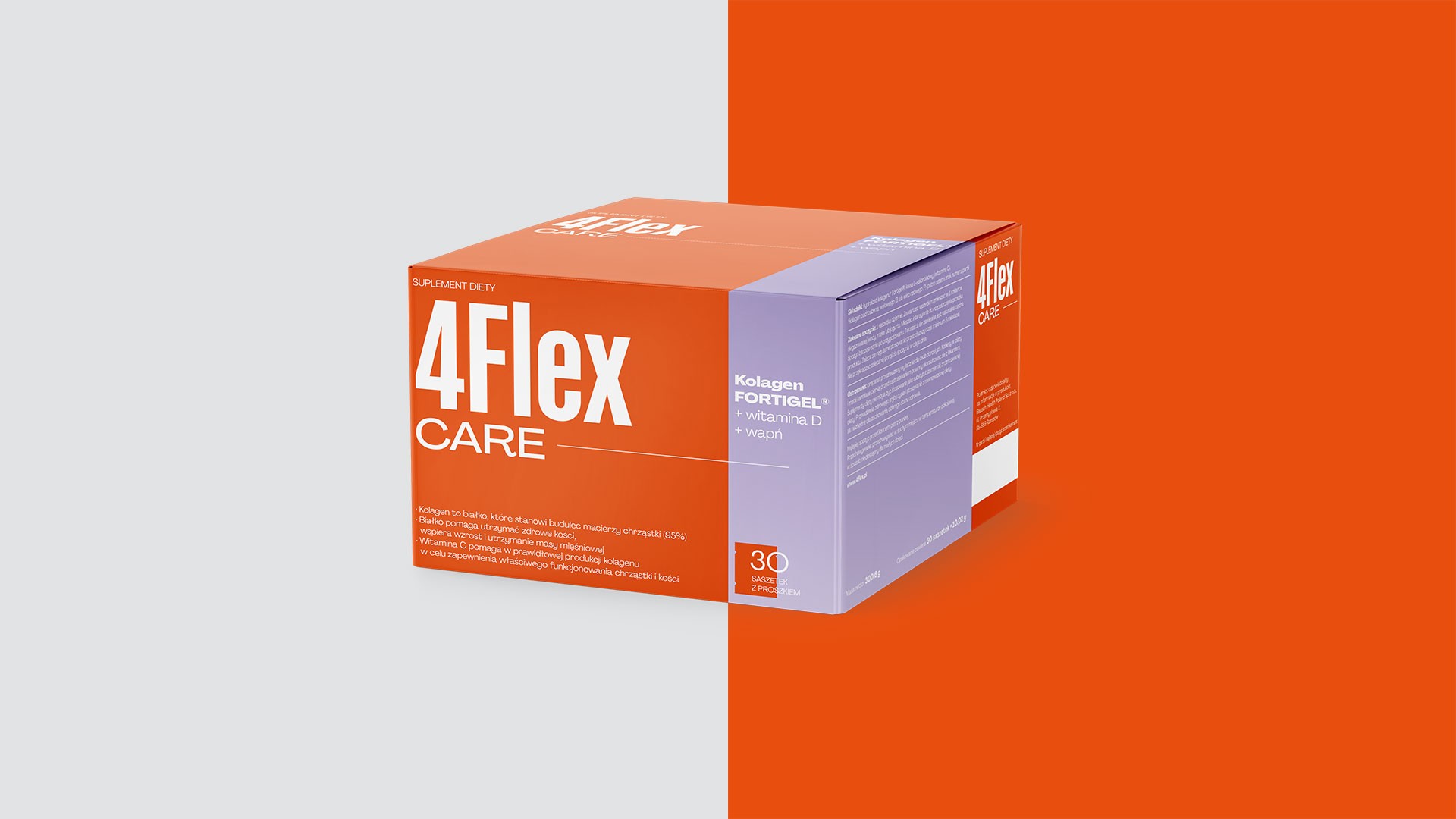
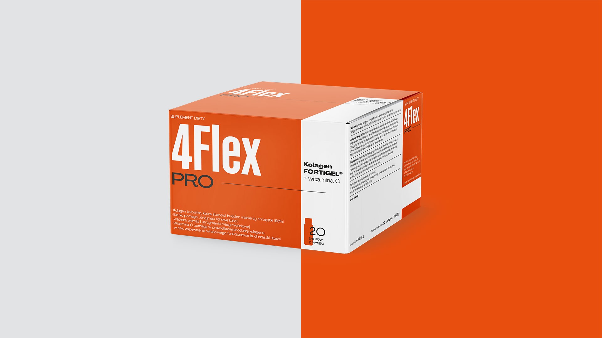
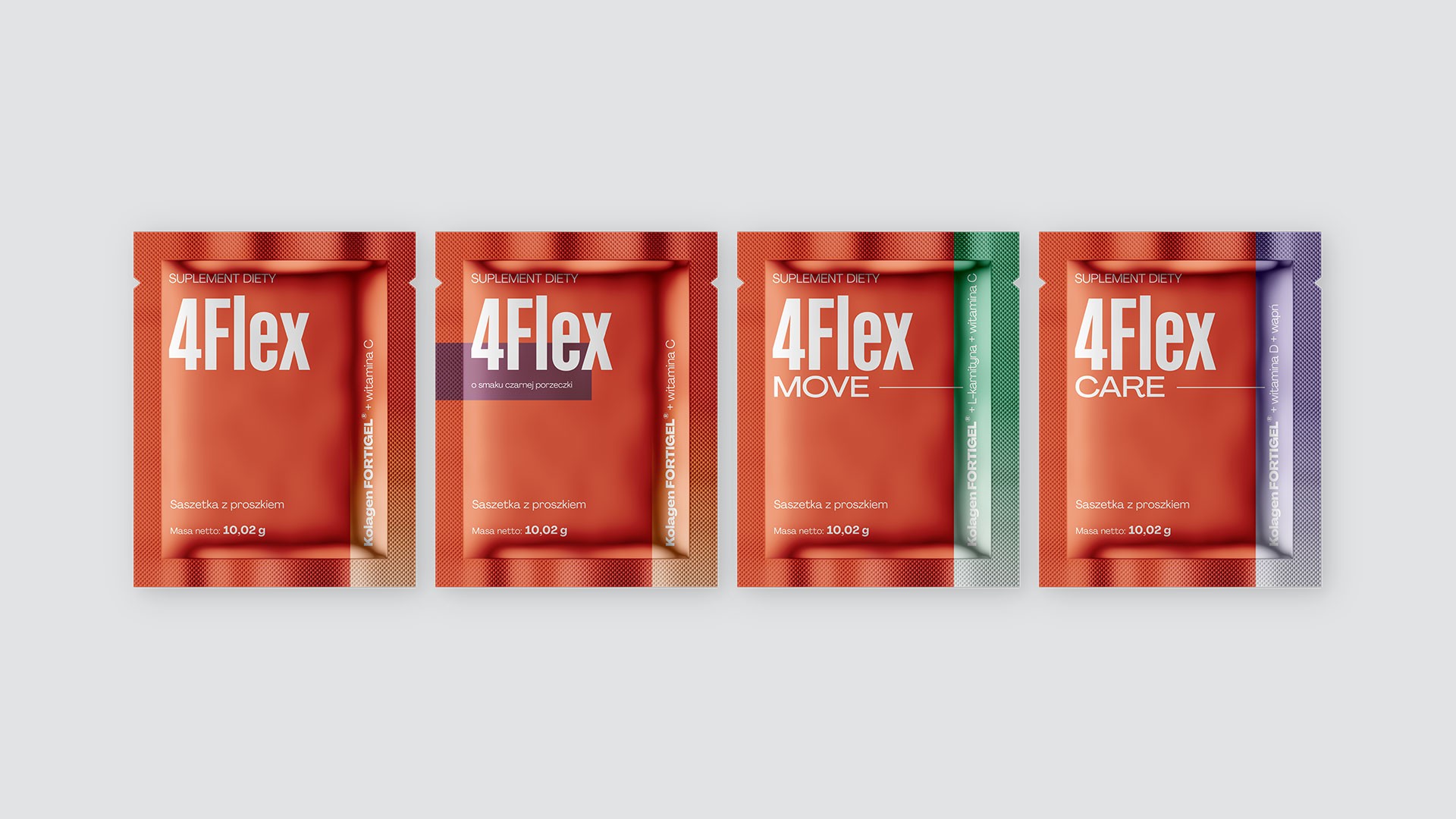
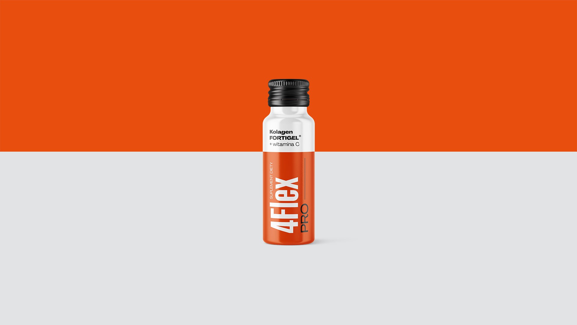
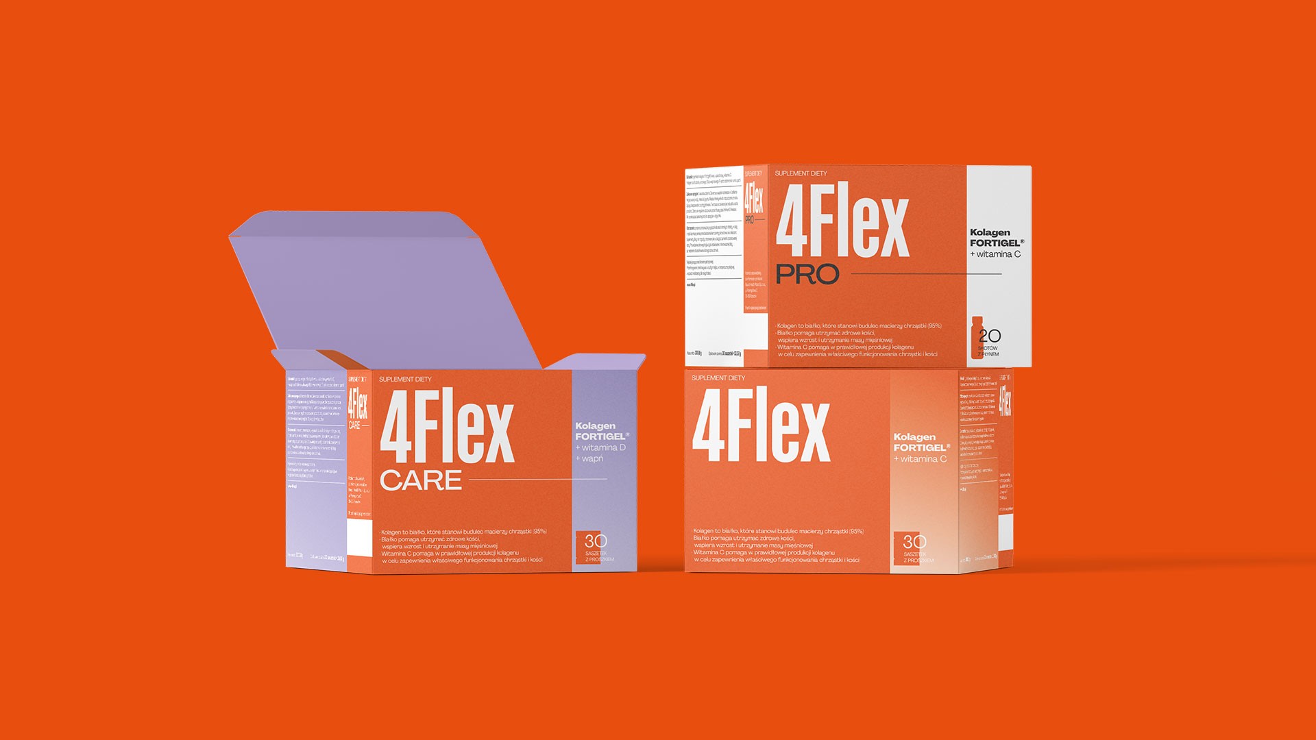
Rather than applying cosmetic updates, the proposal simplified the entire system — orange as the brand's dominant colour, reinforced by supporting colours for product segmentation (PRO, MOVE, CARE). Large-scale sans-serif typography carries the full communication load, eliminating information overload. The system operates consistently across different product forms — sachets, capsules, shots — without separate templates for each. Result: Project completed, not implemented by the client.
Scope
Packaging Design, Art & Creative Direction
Client
4Flex