English
Wall calendar
Task:
Creation of a wall calendar for one of Poland's largest banks.
Solution:
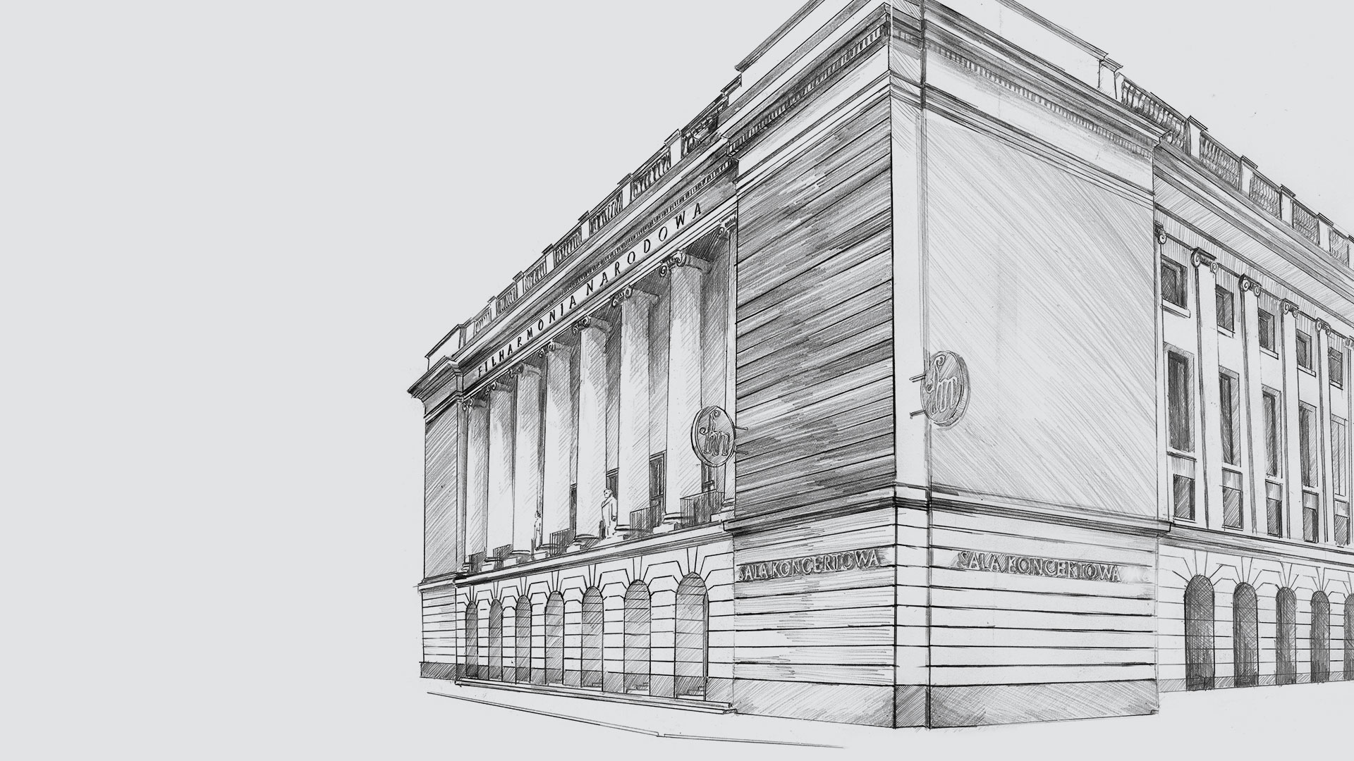
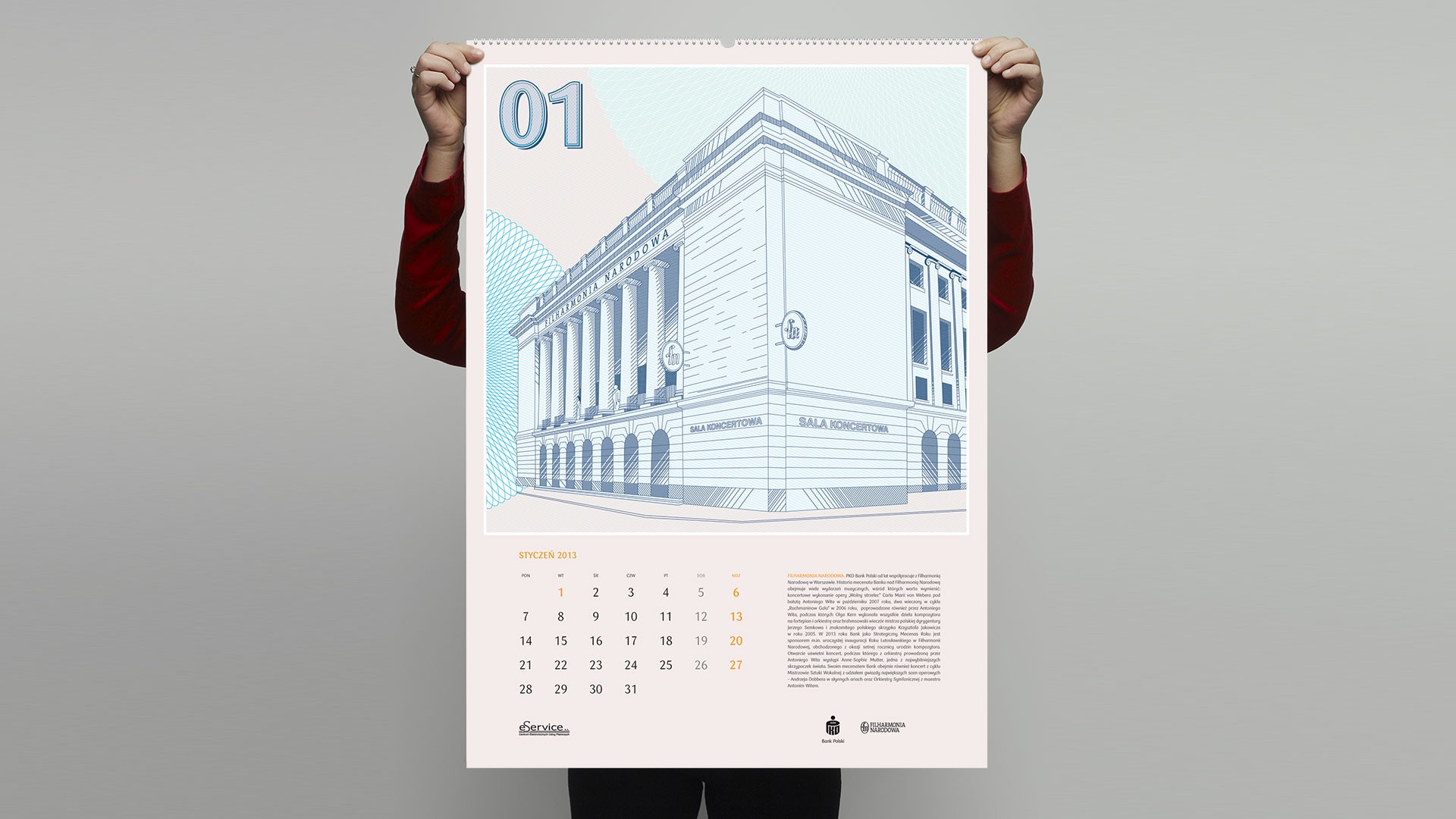
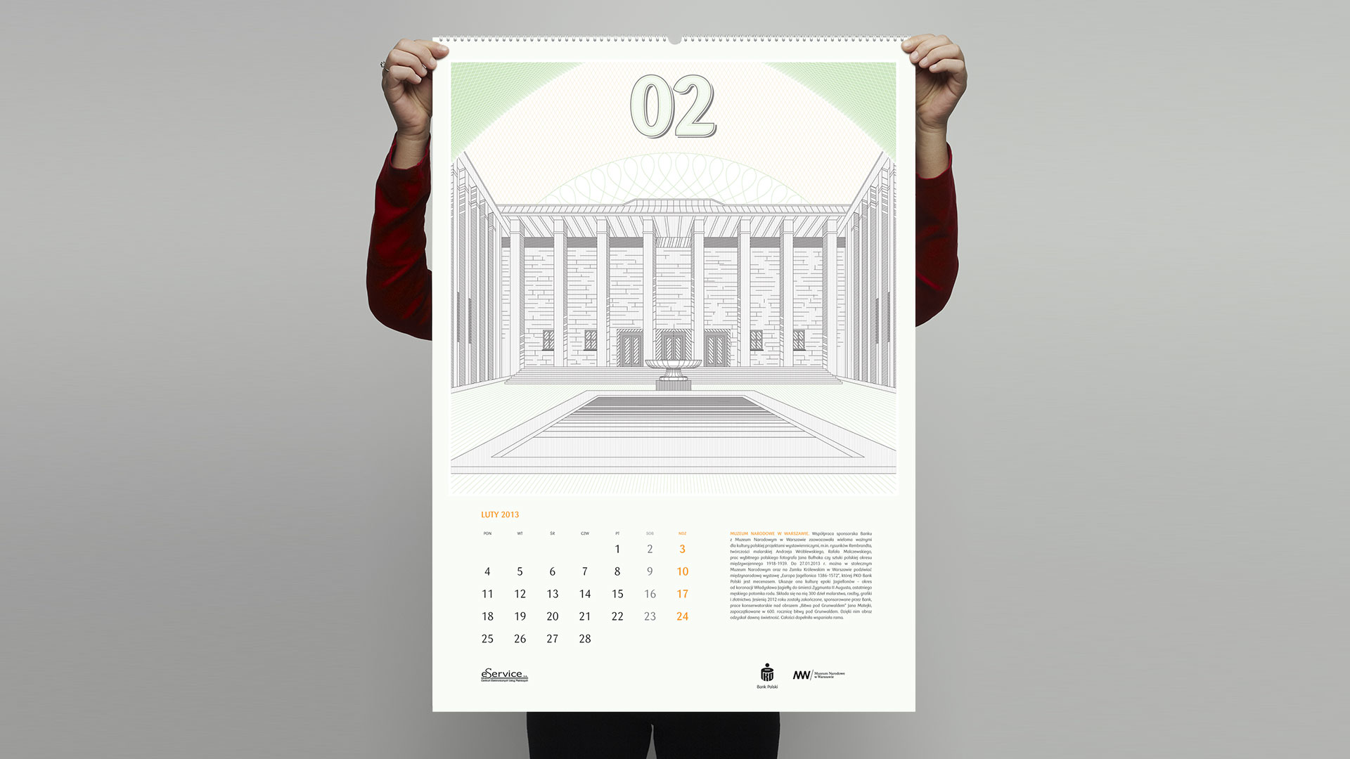
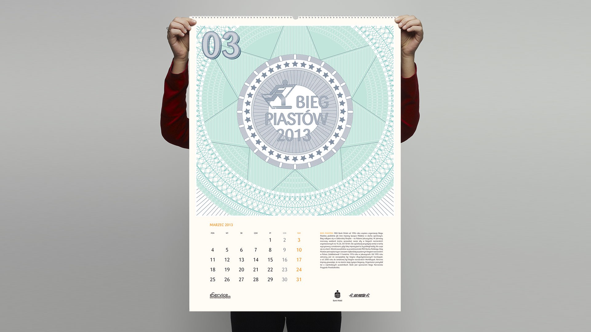
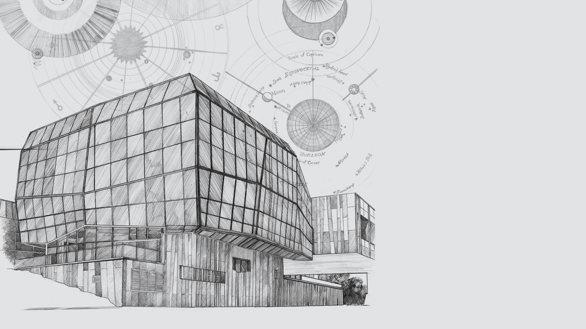
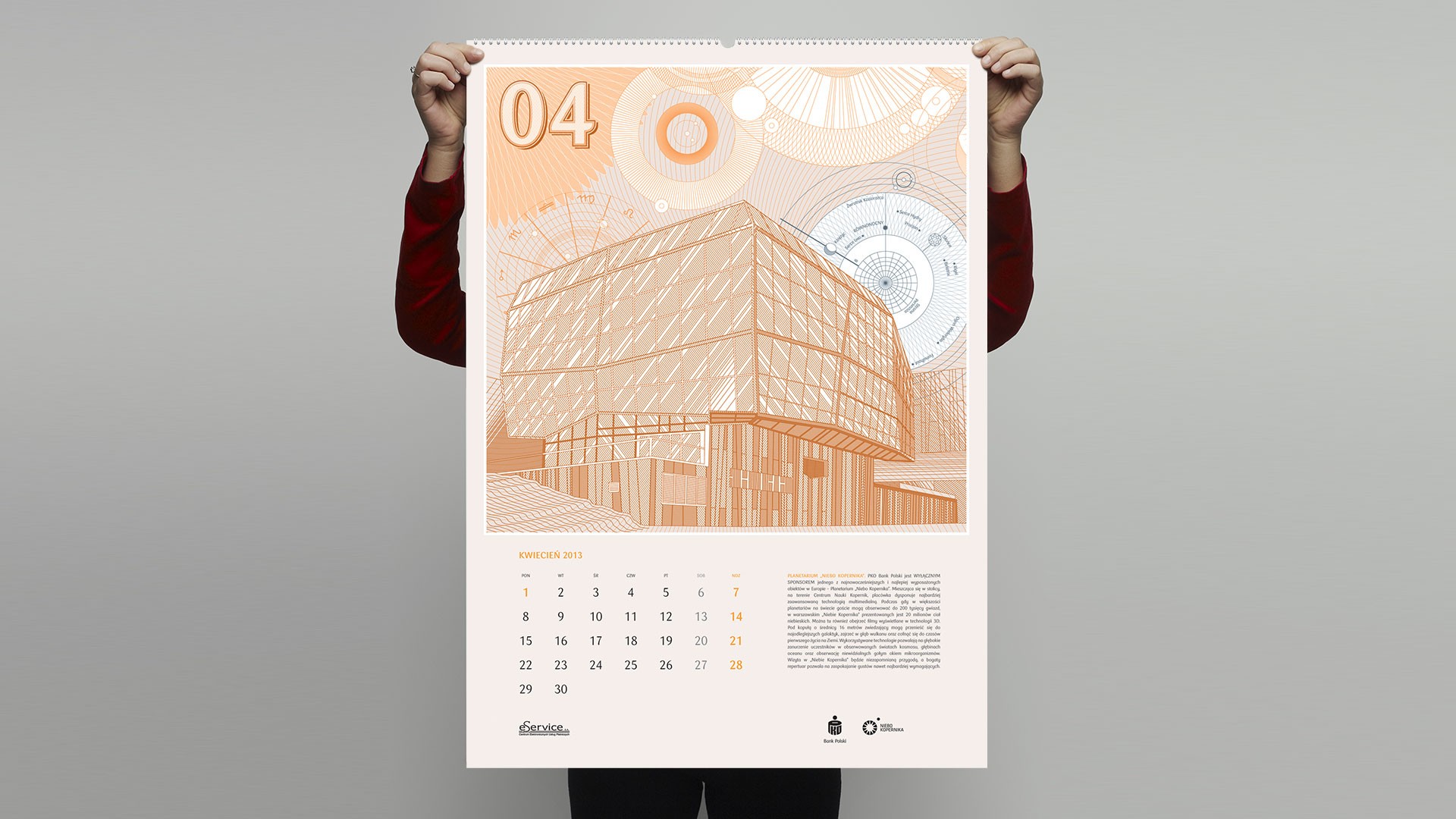
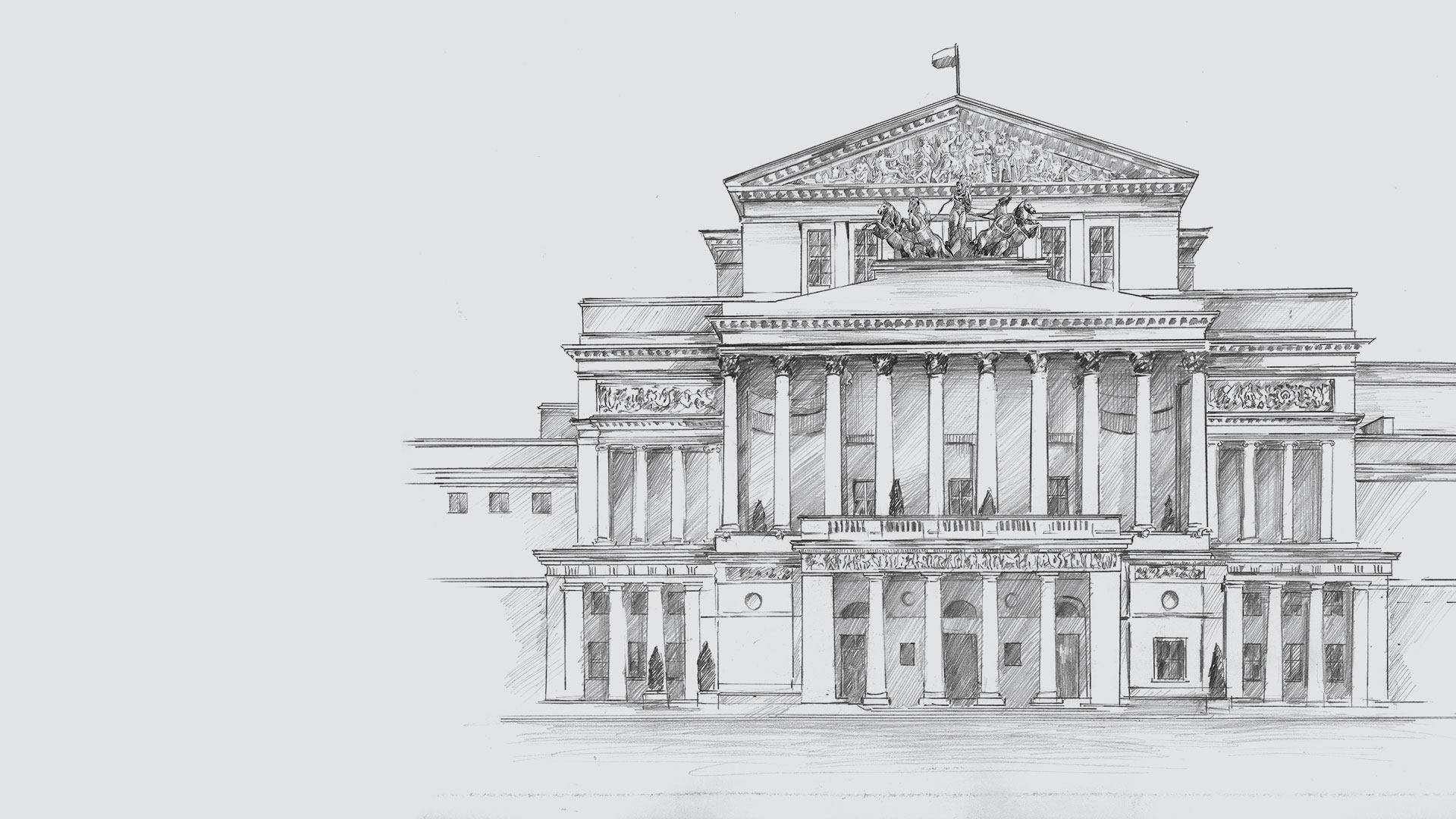
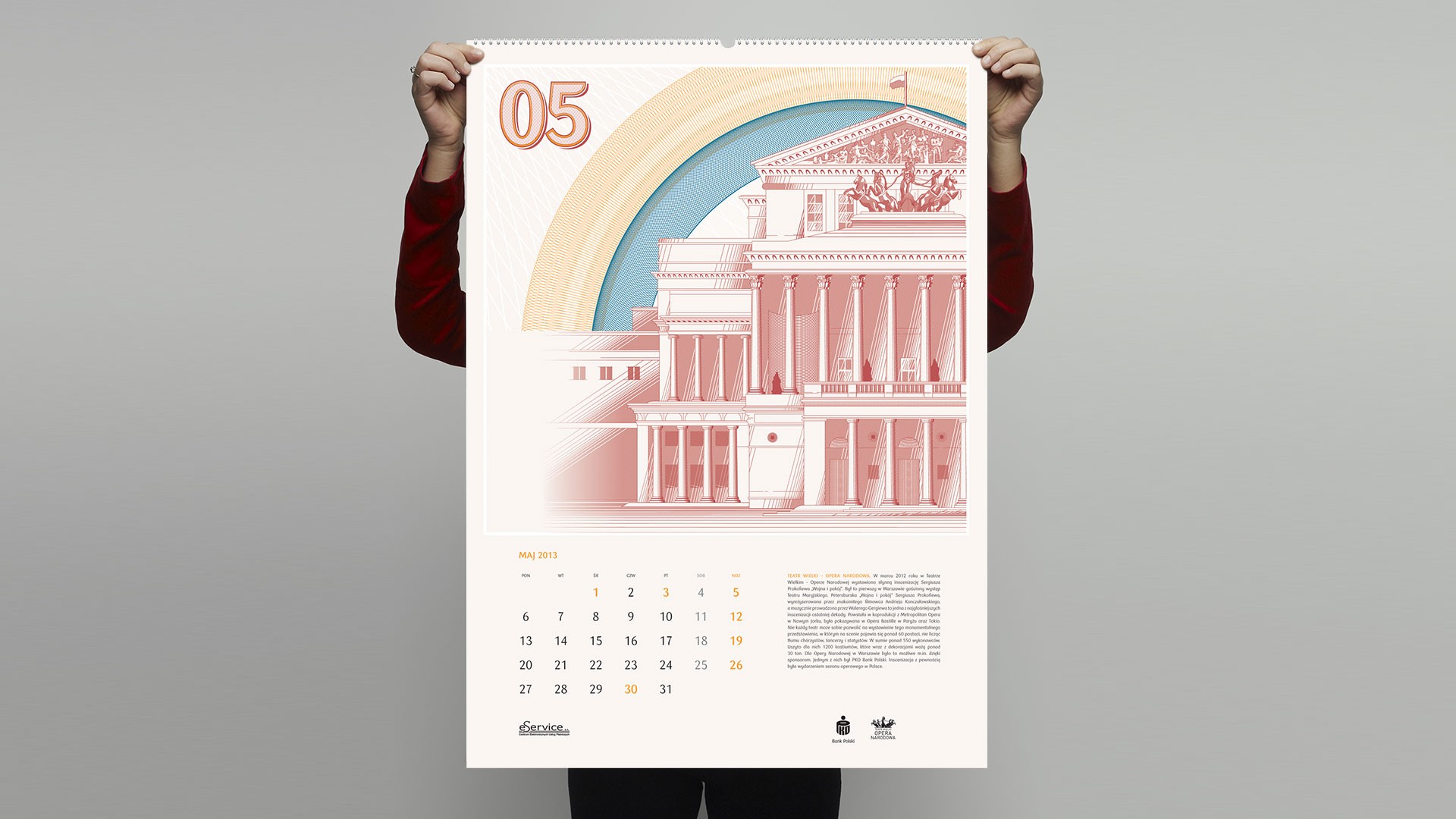
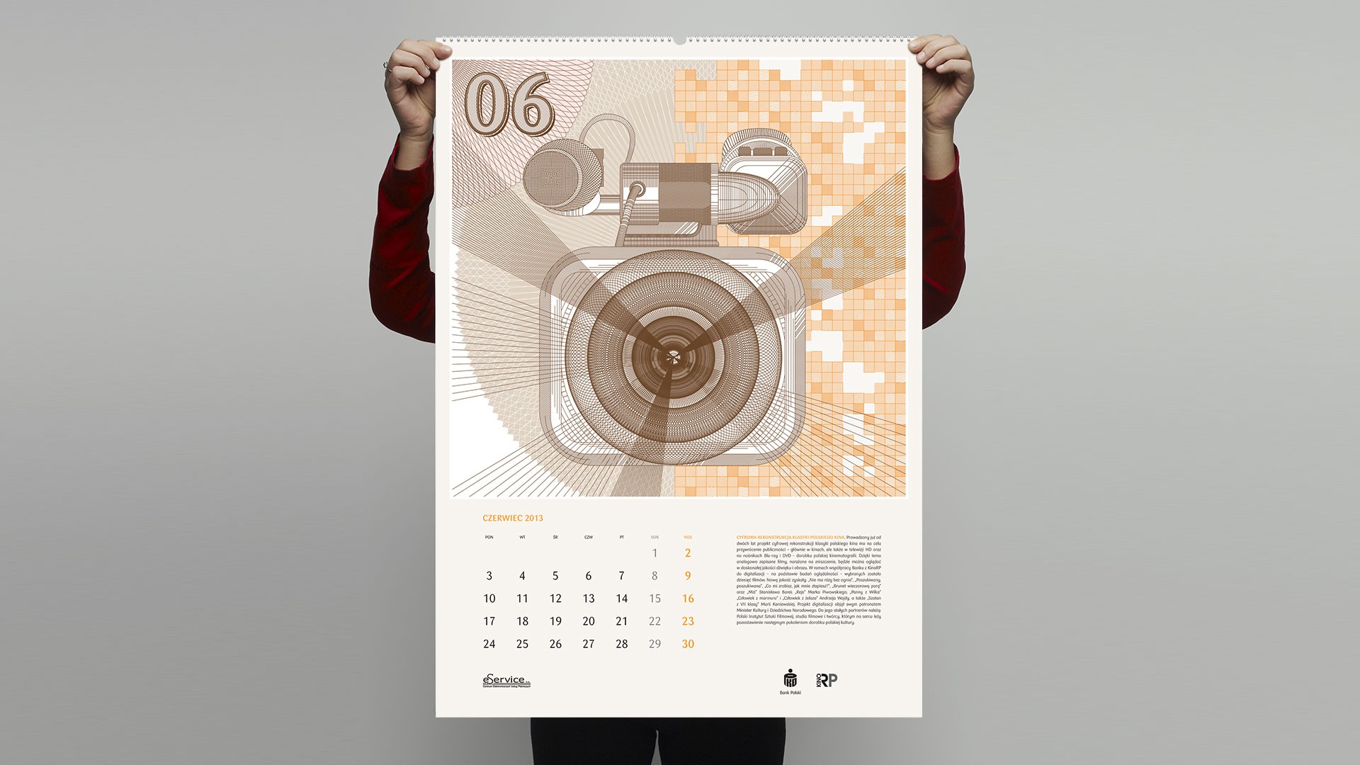
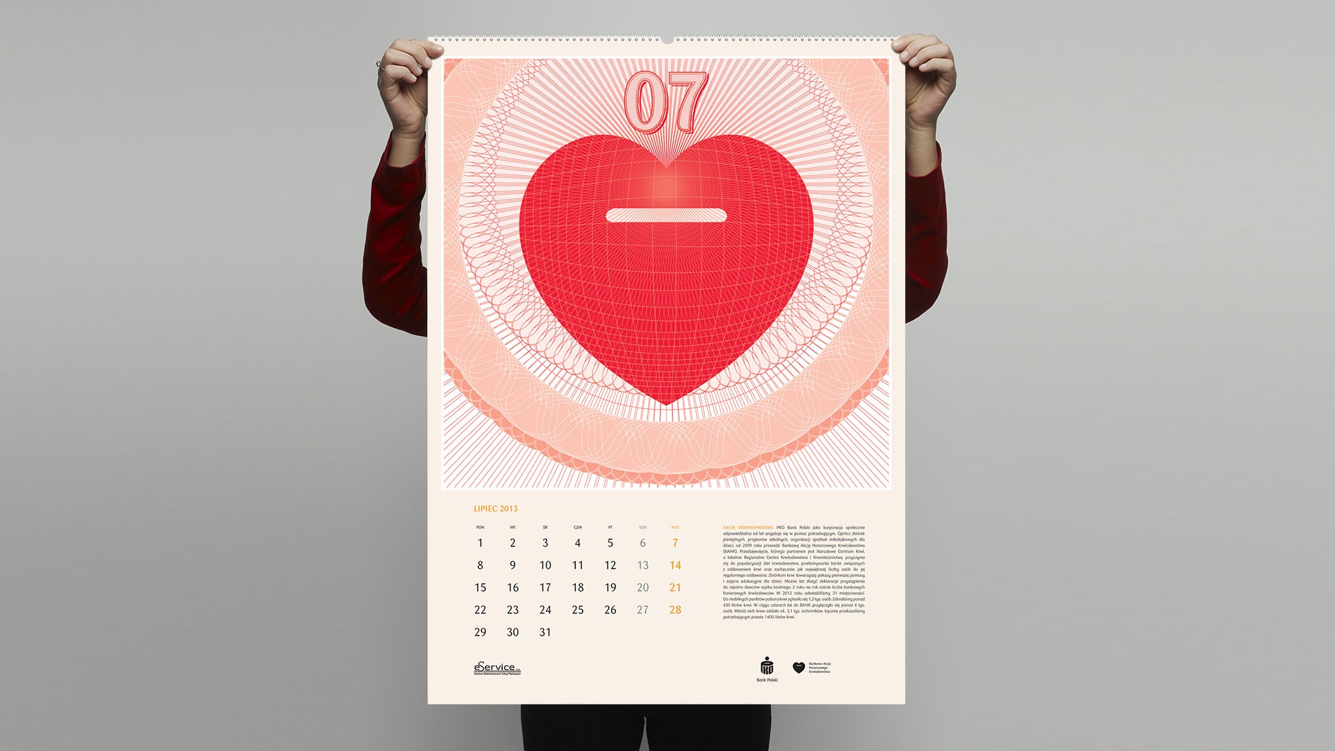
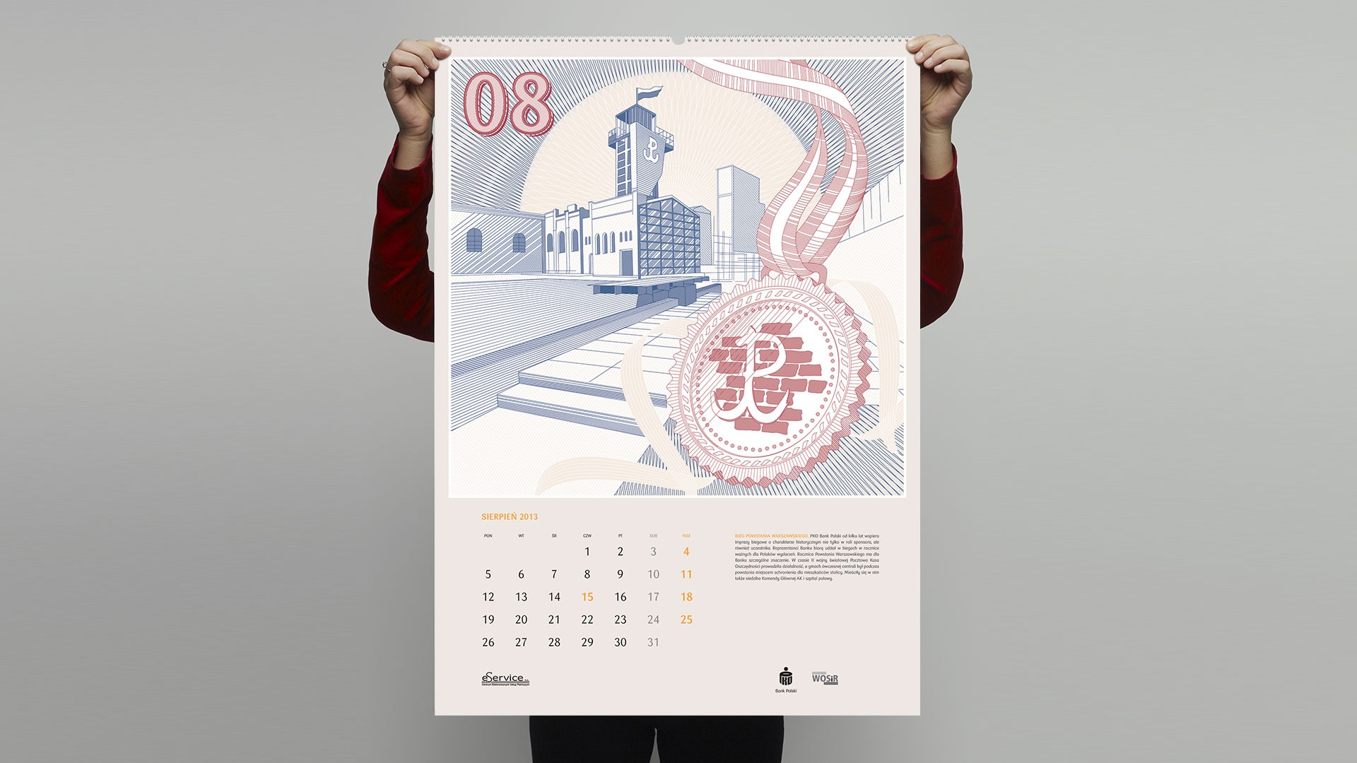
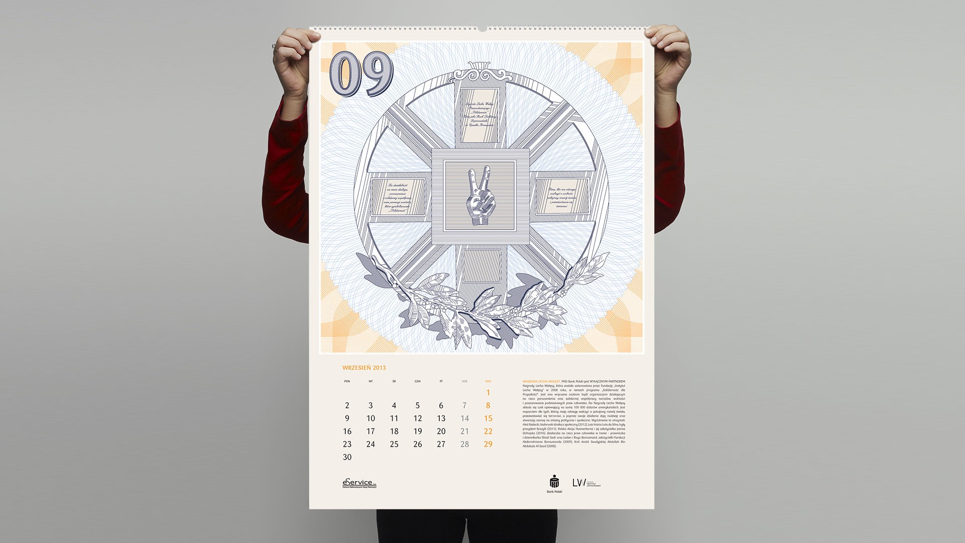
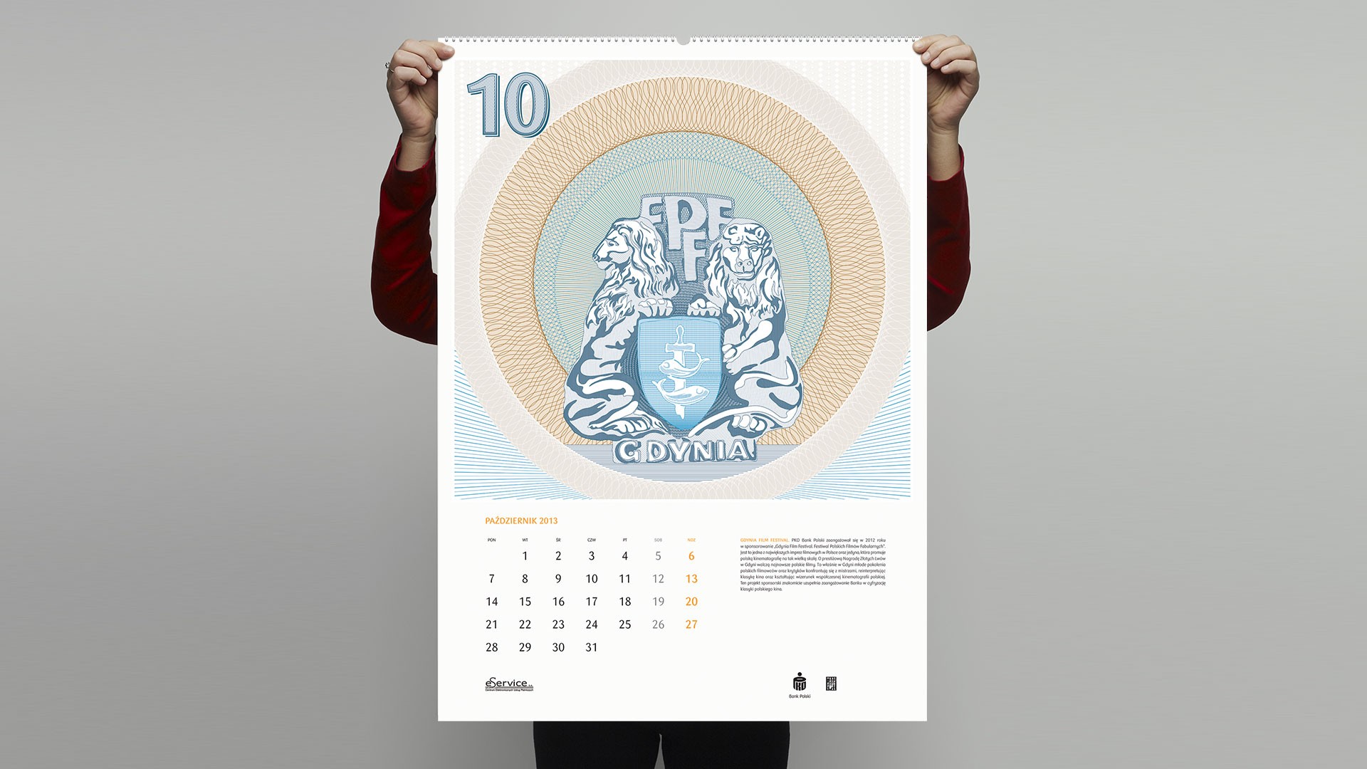
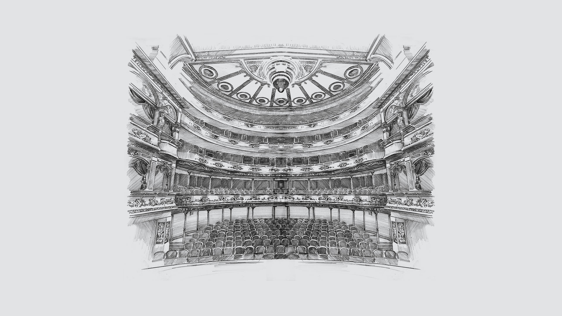
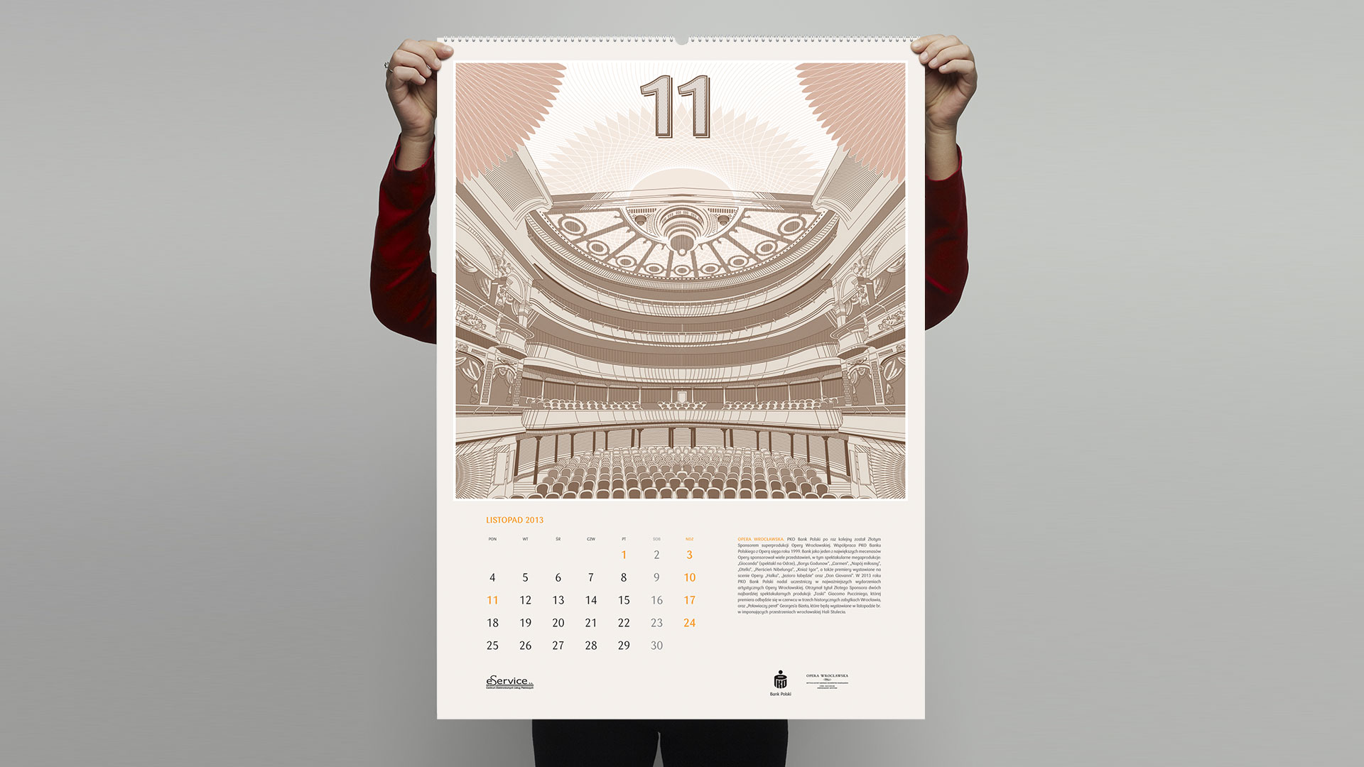
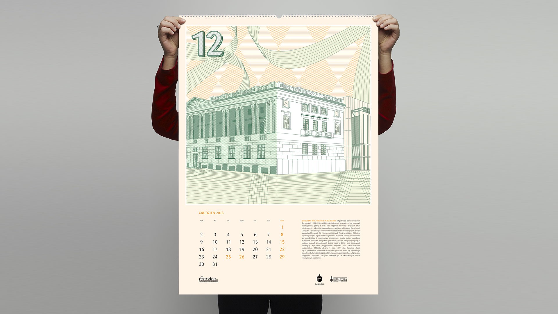
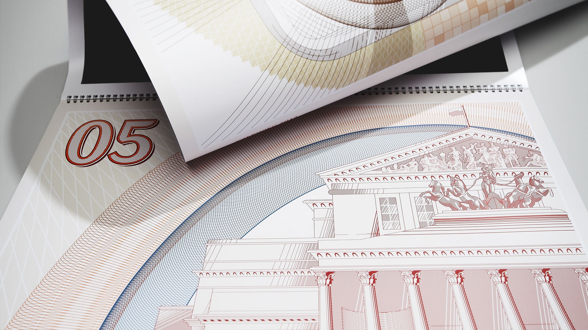
Rather than photography or standard illustration, each month presents a Warsaw architectural landmark rendered in guilloche technique — the same precision line engraving used to protect banknotes from forgery. A deliberate choice: guilloche directly references the financial brand's DNA, building associations with value and tradition. Each month carries an individual colour palette while maintaining system coherence. Result: Vidical 2013 Special Award, KTR 2013 nomination.
Scope
Editorial Design, Art Direction & Creative Direction
Client
PKO Bank Polski